While we'd all love to 'do less' give the client one brilliant idea. I still believe clients want to be involved in the creative process, and often this means giving them choice.
Sometimes I'll present one idea, if it feels 100% perfect. But the exploration, evaluation and just full-blown fun of the creative process means there are often 2-3 ideas on the table. All of them vying for attention, each as good as the other. If you get a presentation like that, without the dull middle one, you've done your job well. There's no shit-idea sandwiched between two good ones.
The most recent project I worked on like this was Potentia. New Zealand's largest tech recruiter. Such an awesome partnership and project, led by strategist Jonte Goldwater. Once we had the positioning 'realised potential' I knew we could head into interesting spaces.
The territories phase helps to explore verbally and visually what something could feel like. Often with found reference, words, images - trying to create a 'feeling' for the brand. Emotions, thoughts, colours, tones. Is it hard-hitting and direct or clever and bright, for instance. As an all-rounder I write and develop headlines that work with the space I'm going to create, or work with a copywriter to bring to life a manifesto which gets the team in the right headspace.
These get discussed, pulled apart and interrogated. Often looking nothing like they started. But that's fine as now we want to get this stage right, so we can move into actual design.
For Potentia this left us with three thoughts:
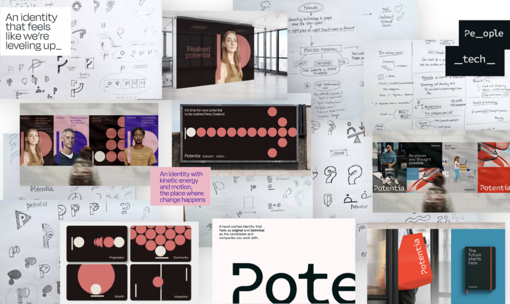
- A bright brand that felt like it was 'leveling up' and felt like a high performance lab
- A kinetic brand which showed energy and motion, where change happened
- A brand that felt 'original' and 'technical' as the candidate and companies they work with
(BTW - I really recommend being punchy, short and detailed here. If you can't explain the idea simply in a sentence with maybe one or two key words, your idea is weak)
Creative concepts
Three full blown ideas takes time. The trick here is to work out how you can create ideas to get your theme across in the most valuable way possible. Is it a series of posters which let you grab attention quickly or a digital application or experiential idea. Every area should be explored. Don't stick to the brief too closely - run with it. For me it was how do I highlight the words in bold in the thoughts above - simply that is all I was trying to do.

Here's an example two shelved concepts, including sketches and background.

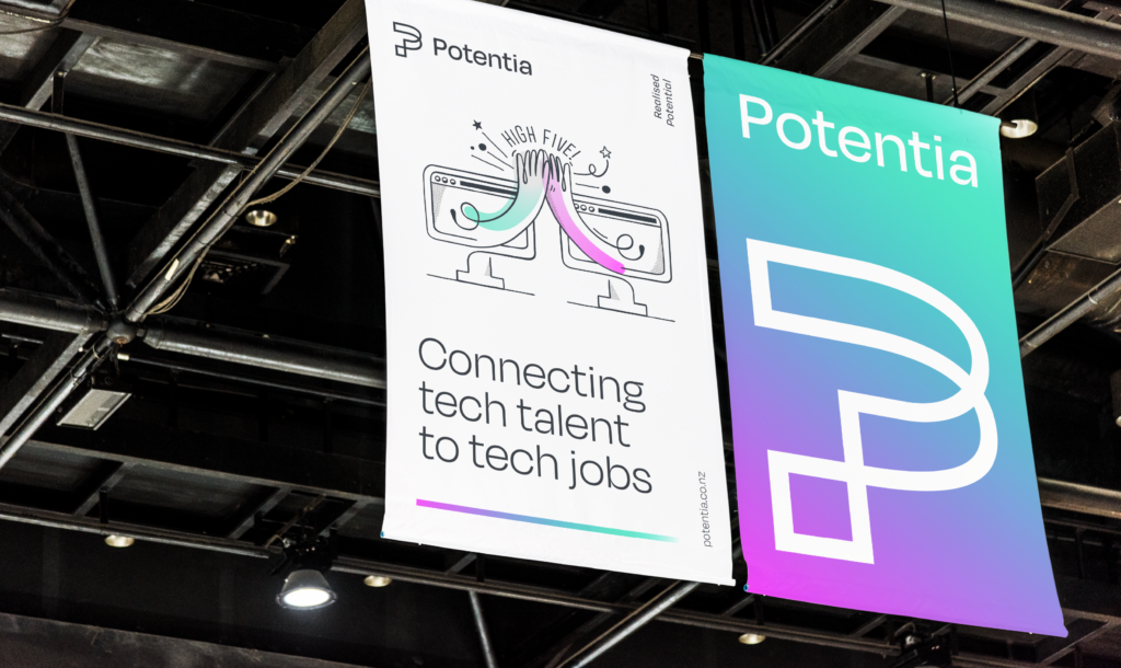
The chosen idea. A bright brand which felt high performance and we were leveling up.
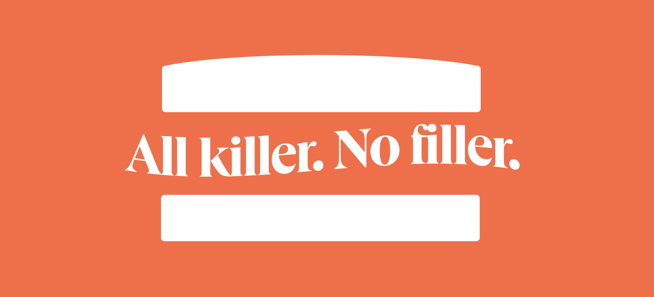
So back to the shit sandwich. The idea no-one really likes, or the weaker idea. In short don't present it. It's a soggy service station egg and cress, leave it the hell alone. If you have a single good idea - present that. Show the client your workings, maybe include them in your thought process. In the odd time you have three winners, go with it.
And watch the clients eyes and your energy levels as you present. You can tell which one is actually your favourite a mile off. Thats the deluxe filling.
I’m Steve, I create symbols and stories with real strategic backbone which resonate with your team, engage your customers and build your business.


No Comments.