Brand Moodly
Agency Symbol Studio
Deliverables
Brand positioning
Brand identity
Tone of voice
Visual language
Digital and social
Animation
Iconography
Brand guidelines
Microsite
Canva Templates
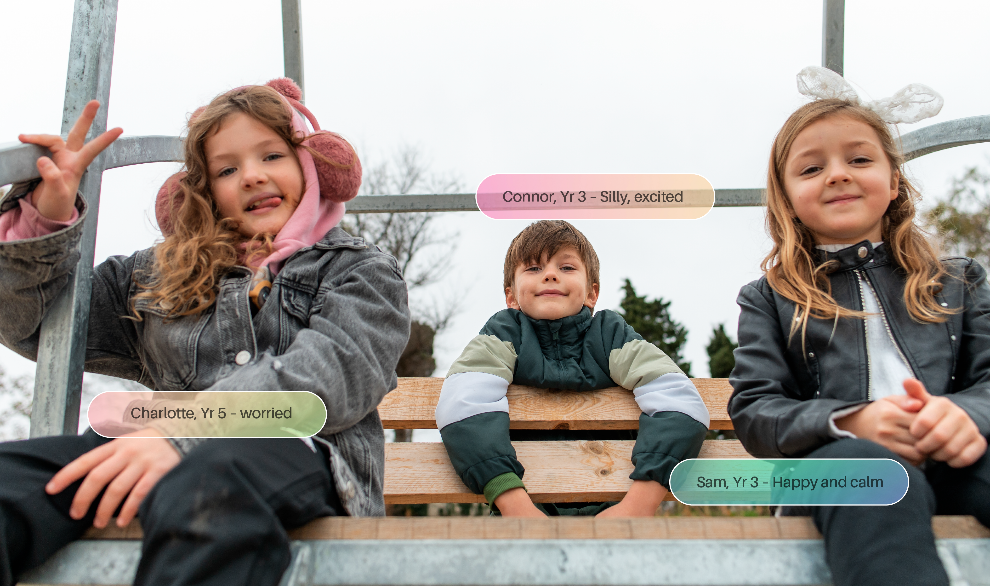
Moodly is an emotional wellbeing platform for educators. Created by UK entrepreneurs Gareth Williams and Morgan Rees, it enables children to express their in-the-moment feelings – so teachers can gain access to a live feed of their school’s ever-changing moods.
Emotional health is challenging for children, the overuse of social media and screen based interactions means they often struggle to share how they actually feel.
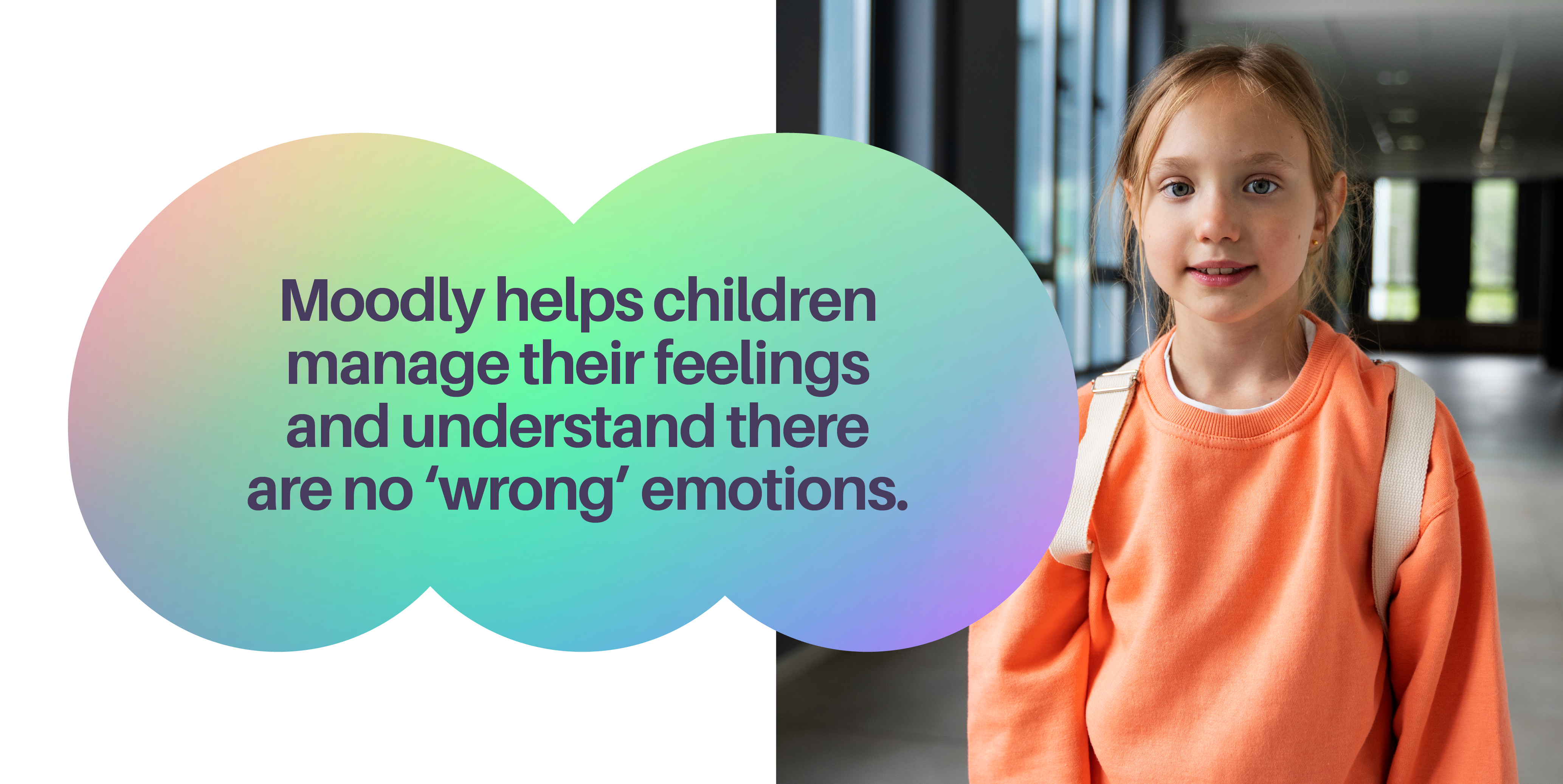
We created a brand fit for the future, to help this amazing much-needed product get noticed, and more importantly used. With real-time access to their entire school’s emotional health, teachers can take broader measures to nurture a positive and empathetic learning environment. To help children manage their feelings and understand there are no ‘wrong’ emotions.
Your school's emotional wellness. At your fingertips.
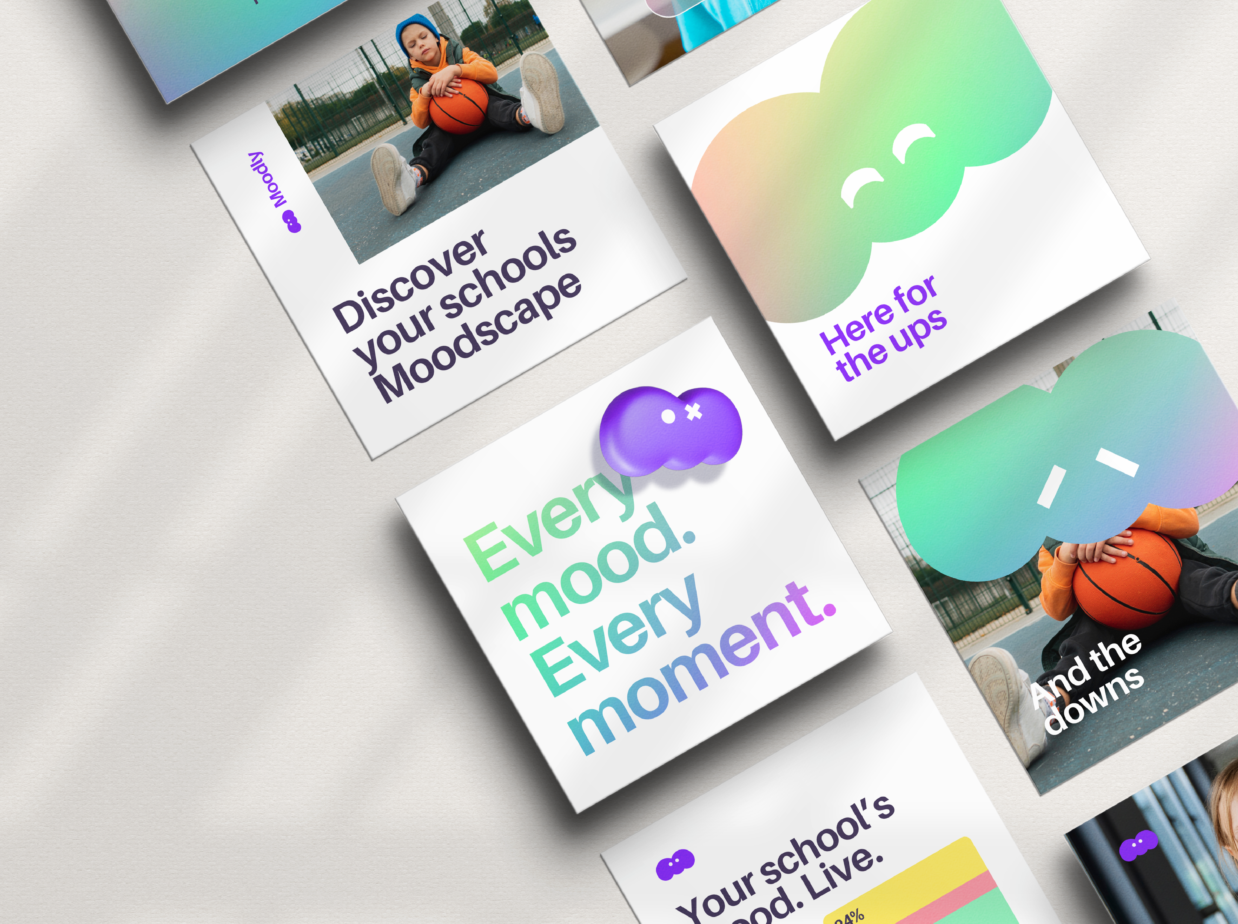
Meet Moodly. The brand which is alive with feelings and emotions.
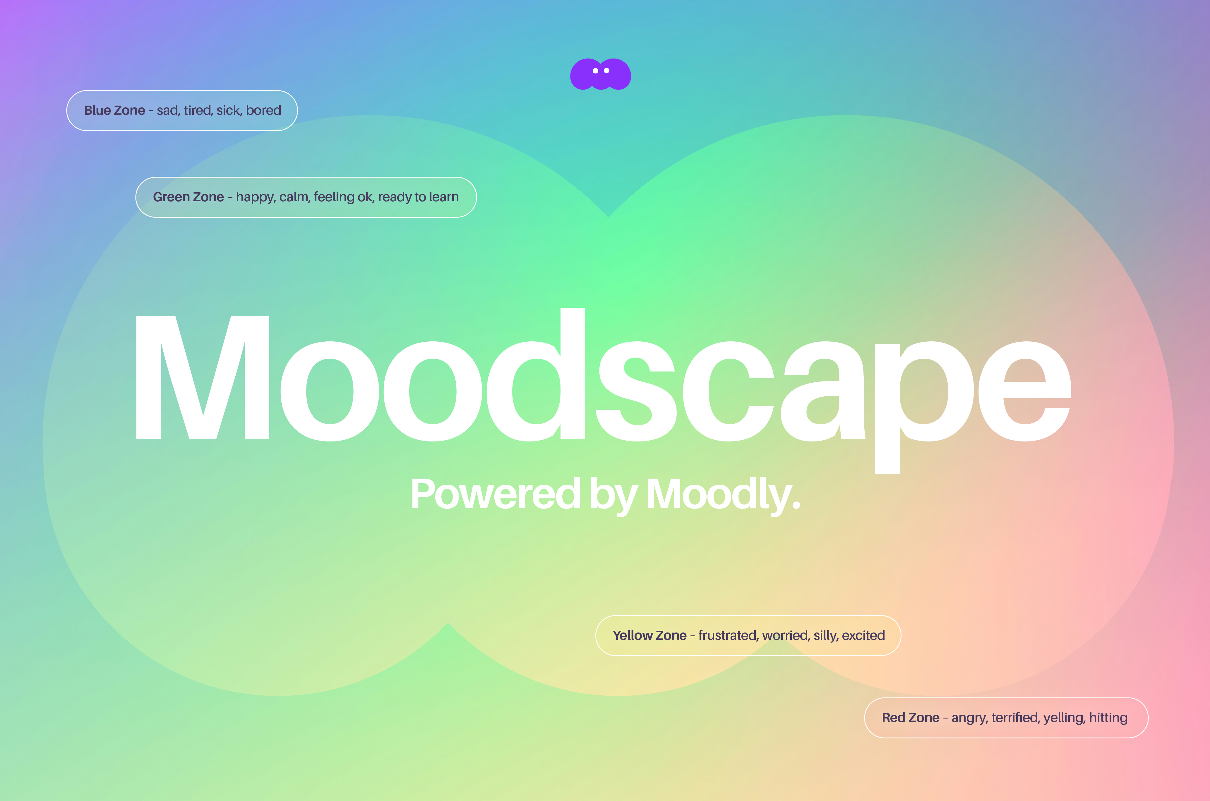
It uses the colours from the Zones of Regulation Theory – a framework for regulating children's emotional wellbeing.
We call this our Moodscape. An ever-evolving landscape, where it's 100% alright to talk about our emotions, or simply check-in quietly.
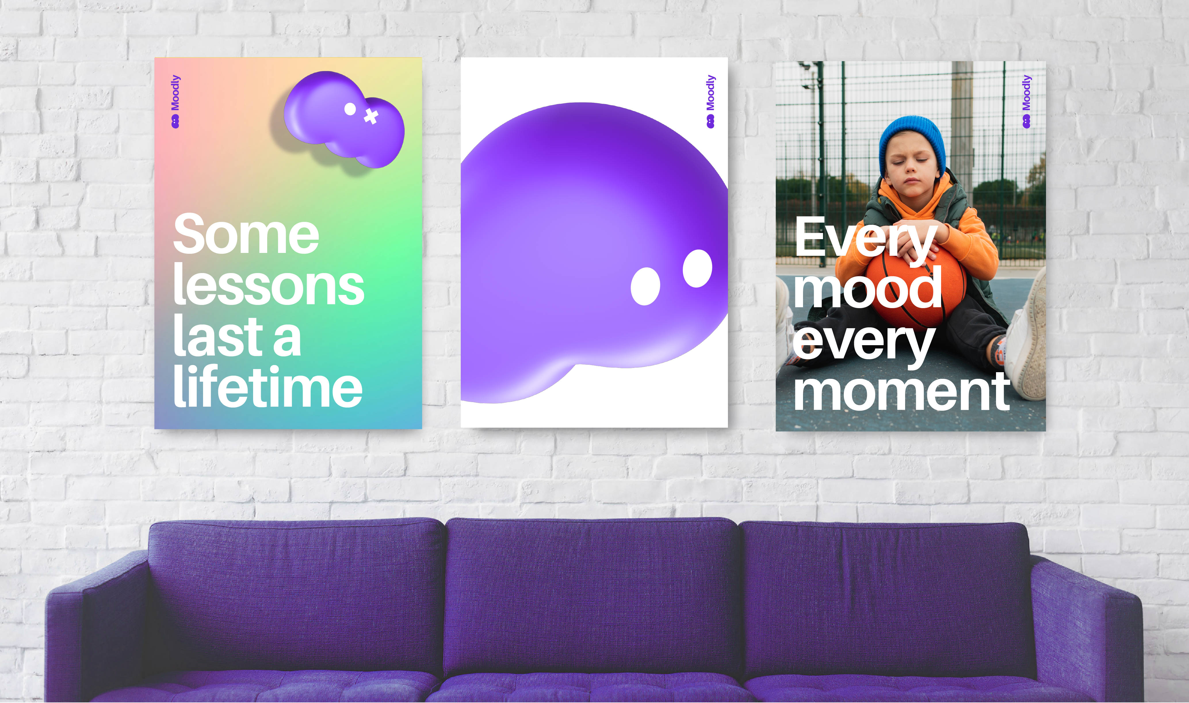
Designed to feel at home in the world of big tech, or friendly enough to help in the classroom, the identity features a warm 'M' shape which has a myriad of feelings. Alongside the vibrant Moodscape palette and tone of voice, the brand is set-up for the future.
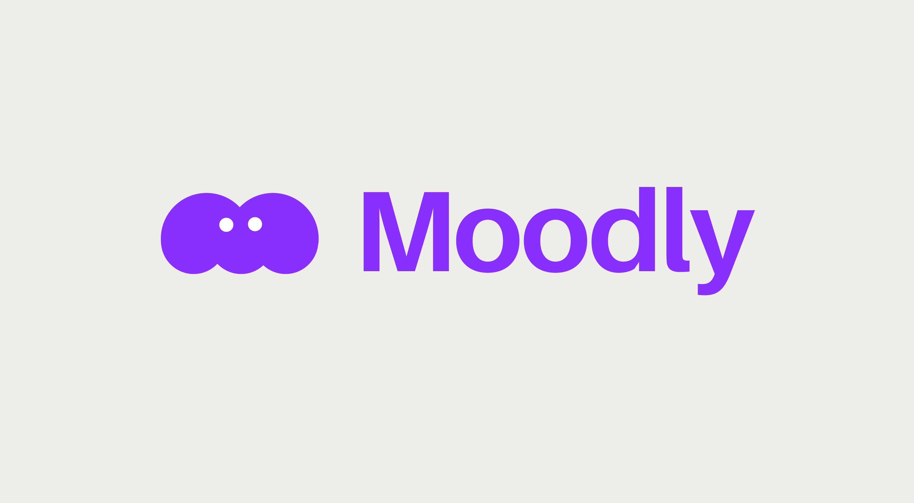

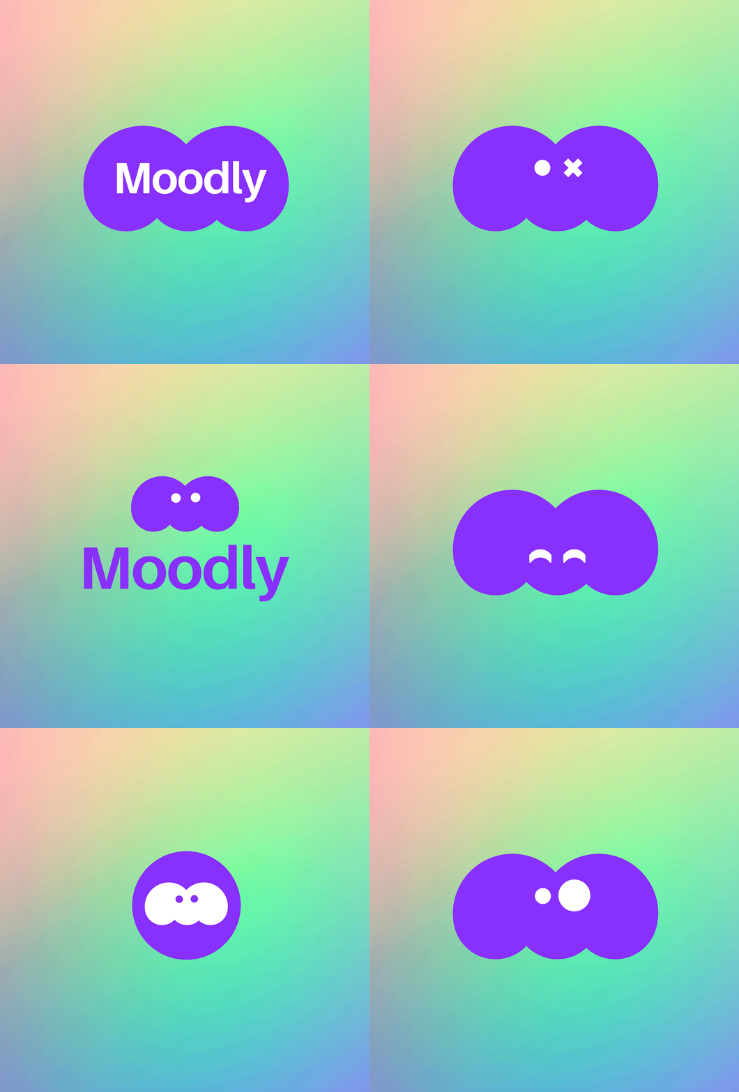
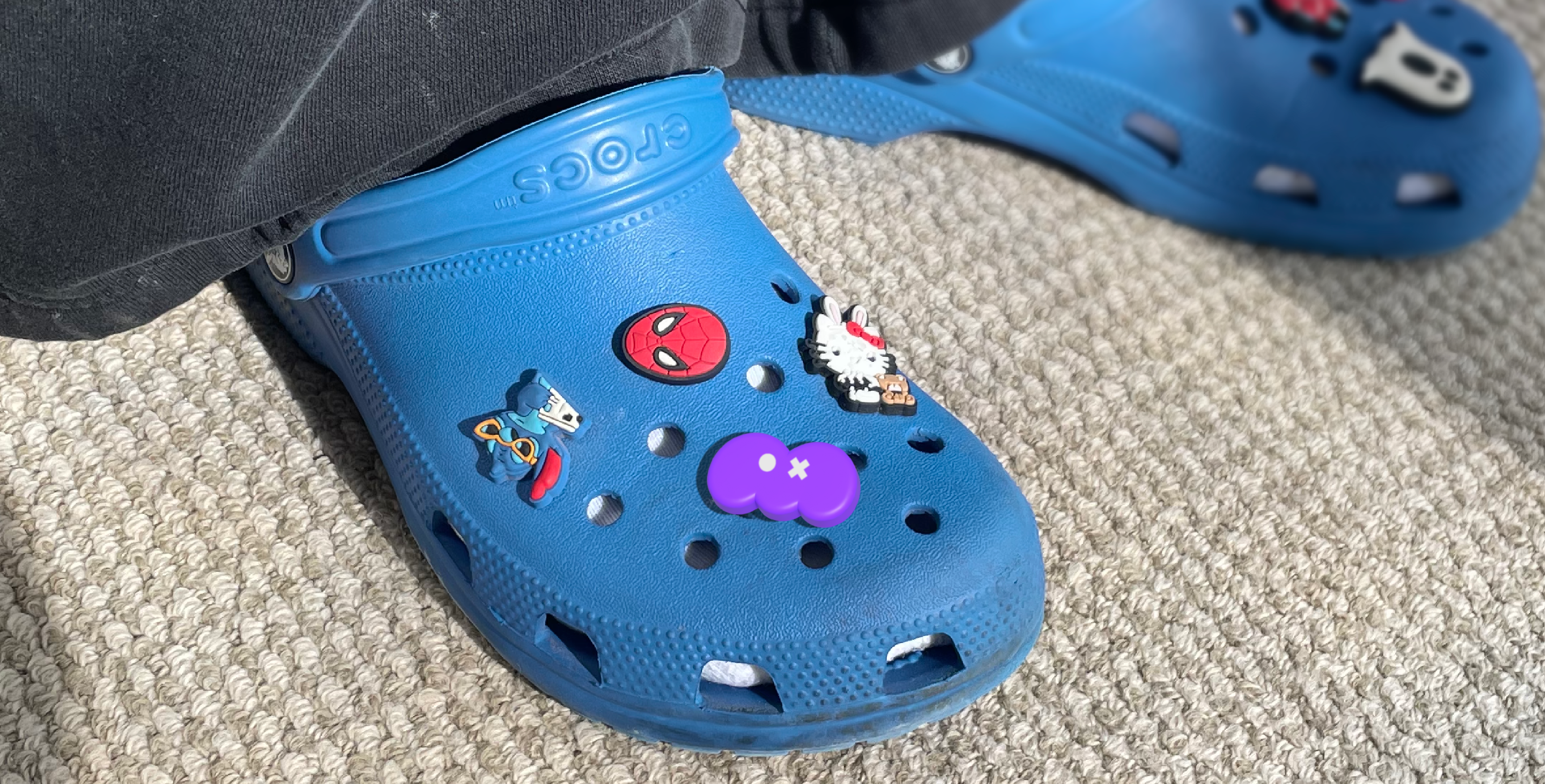
Designed to work at scale and as a social ident the full Moodly identity responds to the various sizes it needs to work at, with the shape and various emotions always a consistent element.

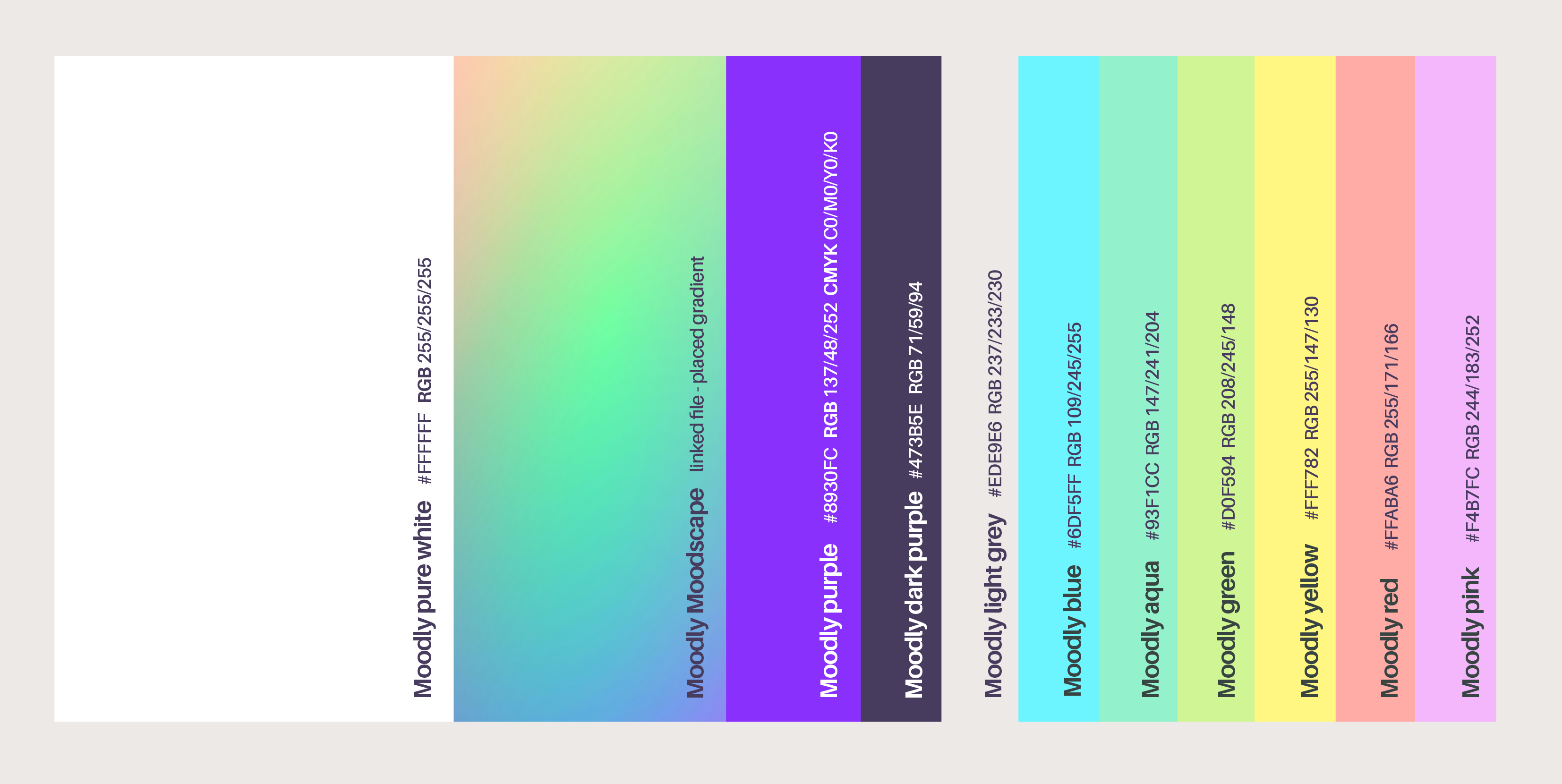
The Moodly purple is used for the brand to have bright pops of colour, and to help the symbol share its range of emotions.
A brand for every mood and every moment
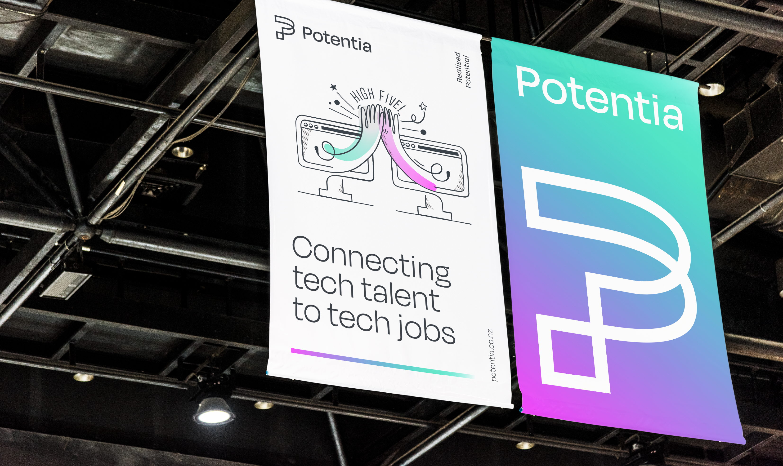
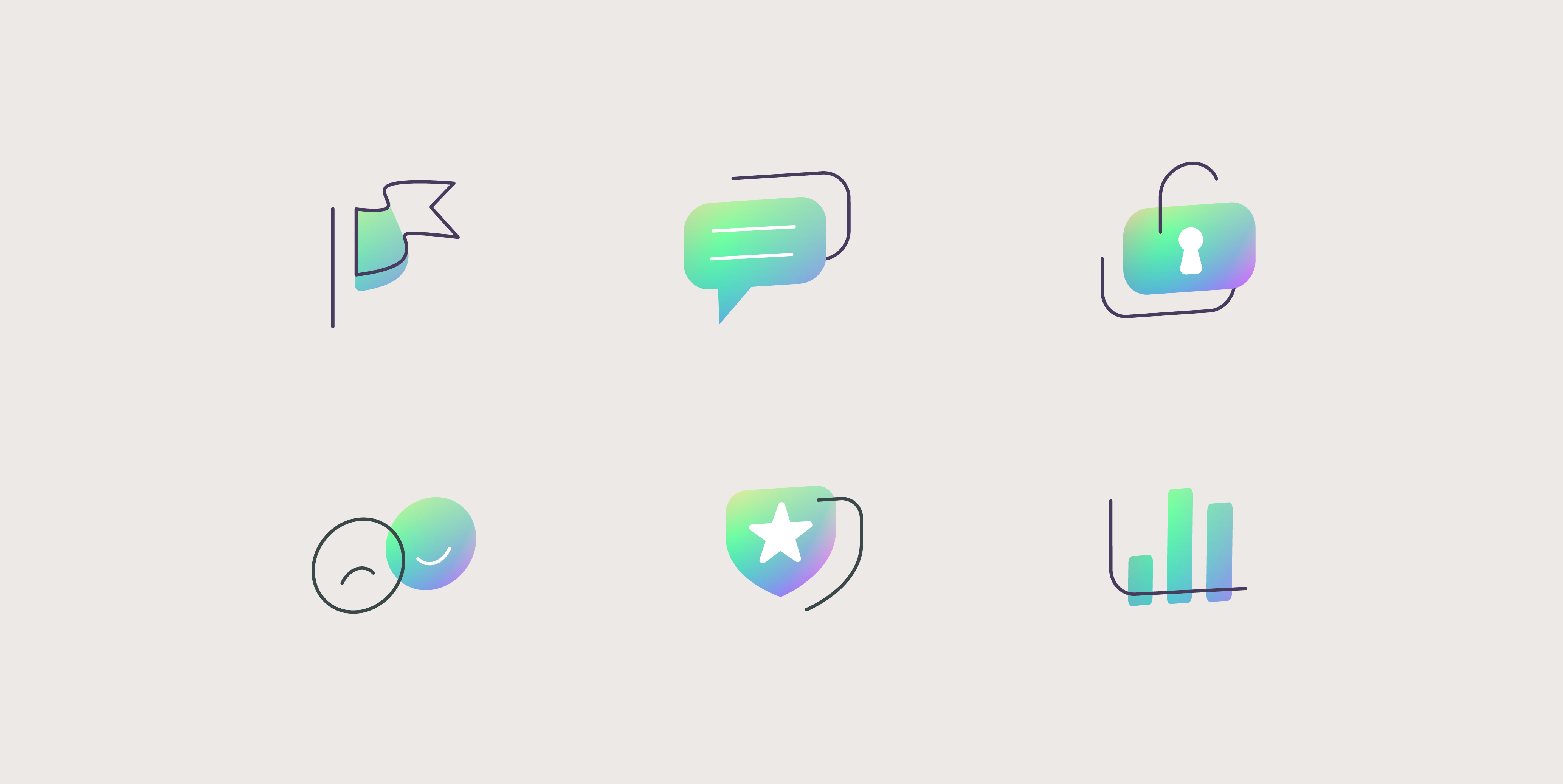
To balance the bright, white palette and vibrant colours we developed a suite of illustrations to work alongside photography.
We landed on a hand-drawn monotone style with pops of colour bringing character and warmth to sensitive subjects. This helps Potentia stand-out in a sea of me-too recruiters.
Each illustration tells a story or helps bring to life a nugget of truth that Potentia understands both clients and candidates and is here for them during the life of your career.
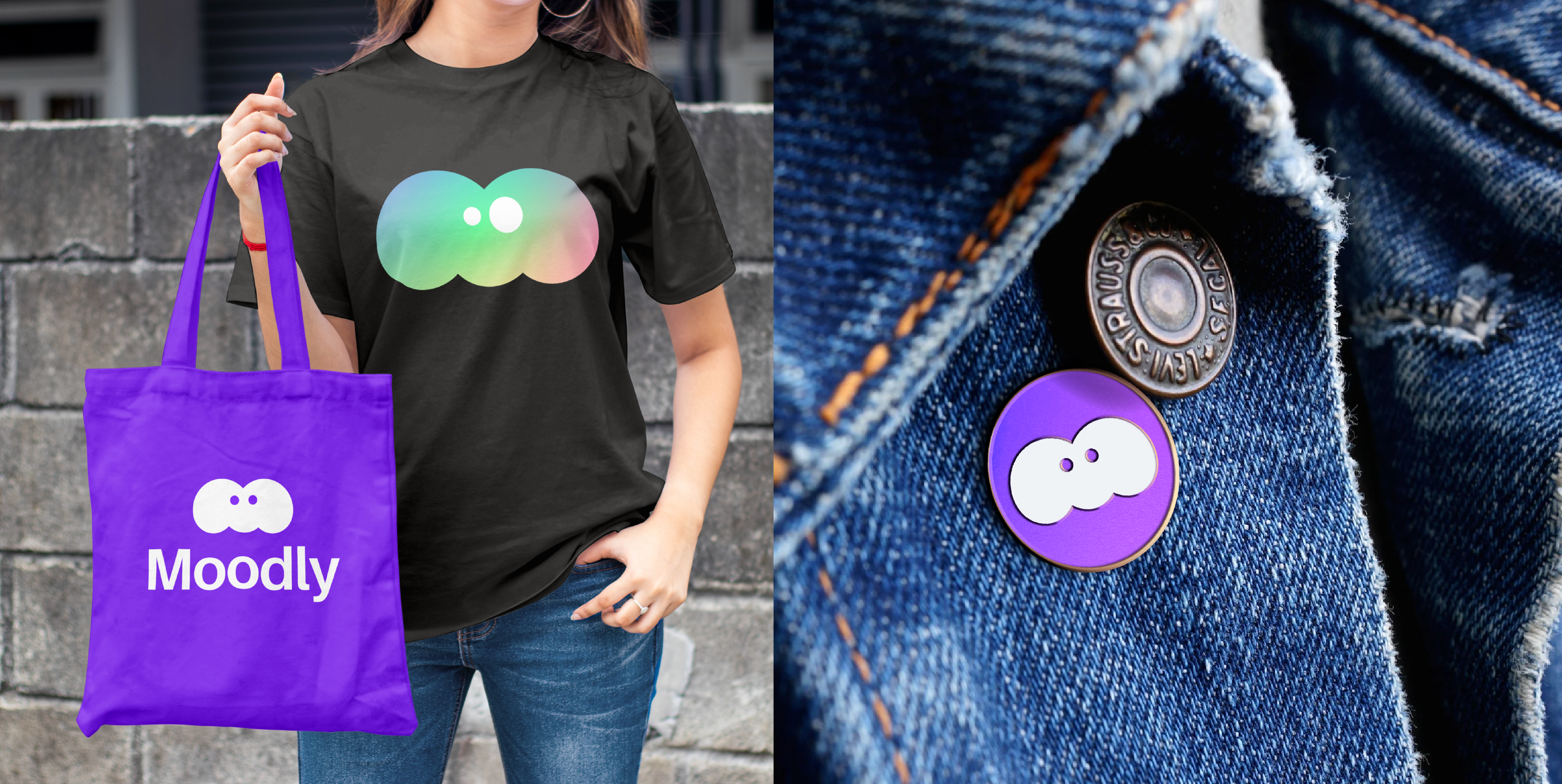
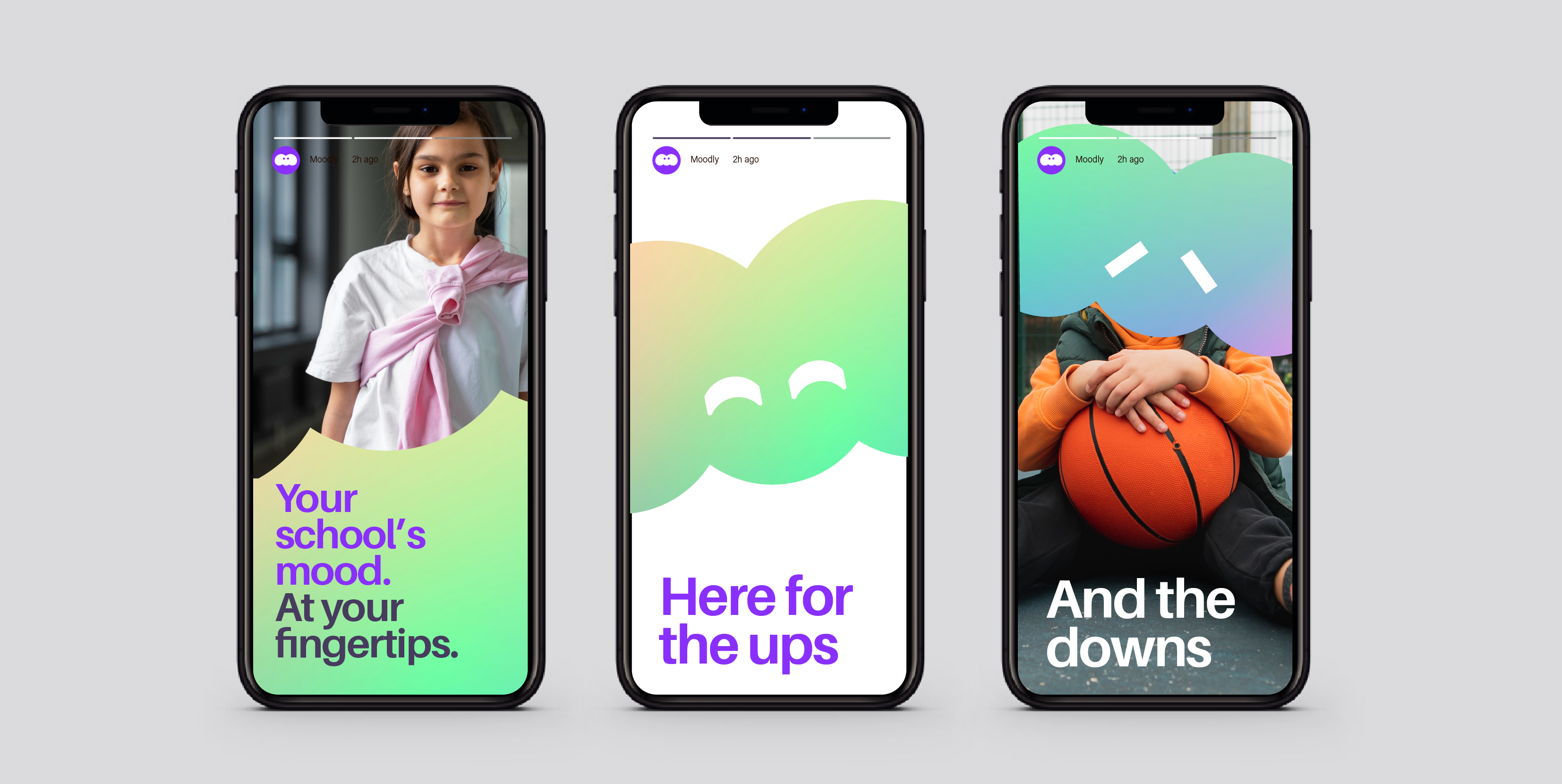

To aid ongoing marketing, the brand was also delivered in Canva with various templates for creds decks and social. This brand kit enabled the client team to create whatever they need for the future in a cost effective way and agile way.
Thanks to a great partnership with clients Gareth and Morgan. Kick-arse Moodscape copy from Tom Brown and responsive design love from Kieran Hawes.
Visit www.moodly.education to find out more
Time to level up your business?
We can work with you to create a brand worthy of the next 5-10 years of growth. Something with real stretch as your business develops.
Symbol Studio is the site of Steve Richardson – Creative Director and Designer. Strategy, Brand and Creativity. Based in Wellington Pōneke, Aotearoa, New Zealand.

